Payment investigation
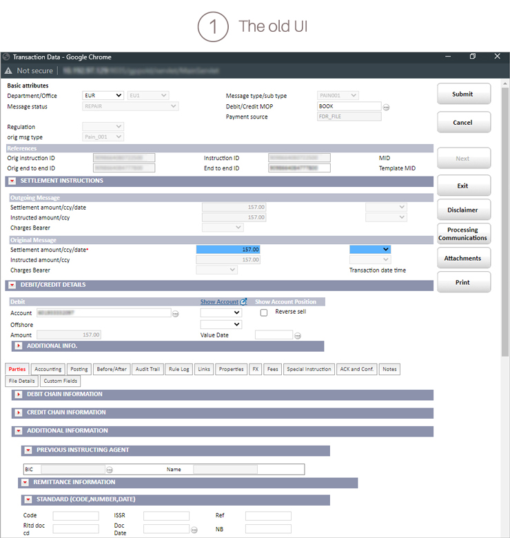
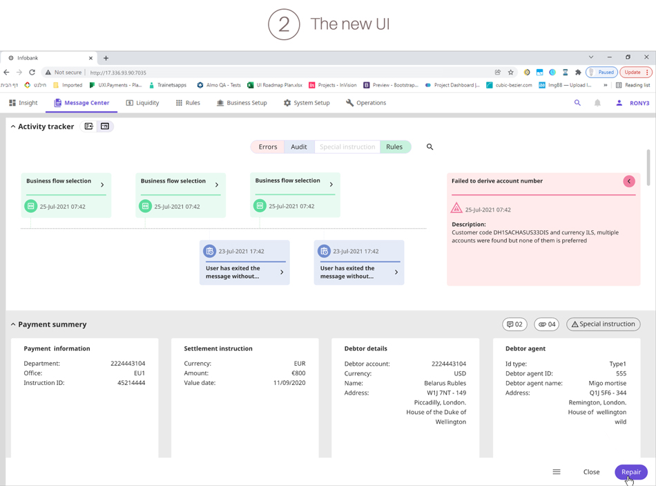
Mission: 1) the old payment ux screen filed with irrelevant business fields 2) the user needed to learn the fields location by heart or spend a lot of clicks over the tabs in order to find them 3) there where lots of vertical scrolling which irritated the user 4) all the actions buttons were displayed on top of the payment and could not differentiate primary vs secondary actions.
Please browse in order to view the new solution:

